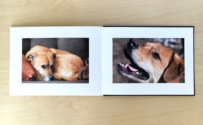
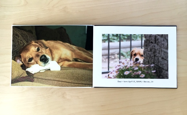
Calling all animal lovers! Andy Parker here, Snapfish Brand Copy Director and dog lover. Recently, I created a photo book dedicated to the two furry loves of my life, my dogs Bear and Dozer. I had a lot of amazing photos to work with (thanks to my husband), which made creating my book a blast. I took lots of notes for you, so if you’re interested in creating a photo book to celebrate your fur babies, read on for pointers and setters. And no more bad puns, I promise.
1. Create a great first impression with your cover.
The cover is the first thing everyone else will see. An interesting, unusual, or amusing image is inviting and excites people to look inside. That’s why I chose a photo that evokes a sense of whimsy.
2. Group photos together by concept, theme, etc., to create interesting spreads.
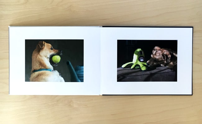
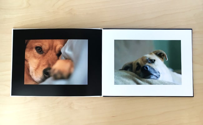
As I combed through my photos, I noticed similarities—photos of my dogs playing with toys or sleeping, photos from the beach or dog park, and so on. Grouping them together helped me make sense of how best to lay them out.
Love these photos that include both dogs and interesting depth of field.
You looking at me?
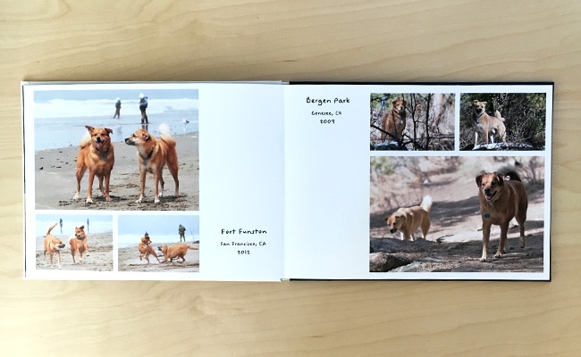
3. Vary your spreads.
Use the layout to create visual interest. If you want to design each layout, keep in mind the whole spread, not just the individual page. Take, for example, this arrangement of photos, which helps your eye flow from one page to the next. Snapfish offers a variety of different layouts (2-photo, 3-photo, etc.) you can use to get started. And, remember, white space is your friend! It doesn’t literally have to be white, of course (see next tip), but creating space around your photos draws attention to their strengths.
4. Use complementary and contrasting background colours.
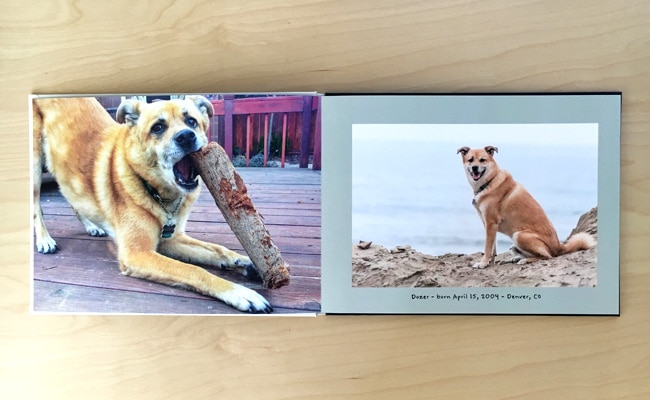
A little colour can really help your photos pop. Take the photo on the right (Dozer on the beach), for example. A contrasting colour helps my sweet little subject stand out.
For this spread, however, contrasting colours overpowered my photos, so I used light neutrals instead:
5. Keep the motion of the viewer’s eye inside your book.
When your subject looks or points to the outside of the page, the viewer’s eye is also guided to the outside of the page…and away from your book. To keep your viewer’s interest inside your book, lay out photos so that the subject looks to the inside of the page.
Now it’s your turn to make a photo book! I hope you’ll enjoy making your book as much as I did mine. Be sure to check out features like designer layouts, Shuffle Gallery, and Autofill that will help you make a beautiful book quickly. Share a few snaps of your finished photo book on Facebook…because who doesn’t love photos of your adorable animals? No one we know.
Originally published by Andy Parker on Snapfish US
What did you create on Snapfish? Share it with us on social media! You can tag us with @snapfishuk in your photos on Instagram or Facebook or use the hashtag #snapfishuk. Don’t forget to follow us on YouTube , Twitter and Pinterest, too. We love seeing what you create.


